
InstaCured
InstaCured started as an idea for a simpler way to access healthcare. My role was to turn that vision into a complete digital ecosystem, from the first brand touchpoint to the moment a patient connects with a provider.
I designed the patient experience, provider workspace, admin dashboard, landing page, and the design system that brought everything together.
Turning a vision into a product
InstaCured is a US-based telehealth startup focused on making urgent care, prescription refills, and primary consultations more accessible. When I joined, the founders had a clear vision for the product but nothing users could interact with.
Over several remote sprints, I designed the platform from the ground up: a patient app, a provider workspace, a lightweight EHR, and the brand that tied everything together.
Learning from products already solving the problem
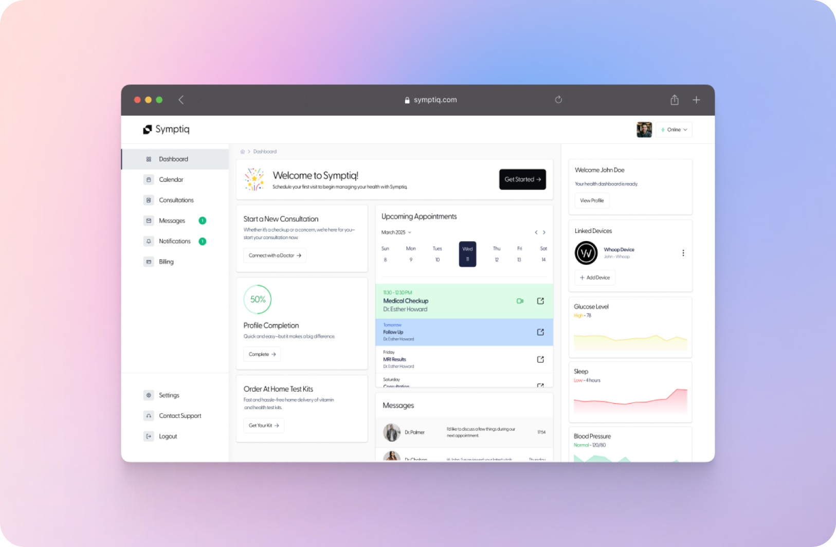
For most telehealth platforms, the biggest obstacle isn't speaking to a doctor, it's getting there. Patients are asked to complete lengthy questionnaires before understanding pricing or availability. Providers move between separate tools for appointments, notes, prescriptions, and messaging. Every extra screen adds friction before care even begins.
Without direct user interviews, I relied on weekly sessions with the founding physicians and competitive research across healthcare and consumer products.
Lengthy Onboarding
Patients abandon signup when medical forms feel like paperwork instead of care.
Unclear Pricing
Cost anxiety is the silent killer of telehealth conversion. Patients won't book what they can't price.
Fragmented Systems
Providers juggle disconnected tools for messaging, notes, and prescriptions, slowing down every consultation.
Building the foundation
Instead of designing screens first, we designed the product's structure. Working alongside the founder and project manager, we divided the MVP into three connected phases. Each solved a different problem, but together they created one continuous healthcare experience.
Mapping the journey
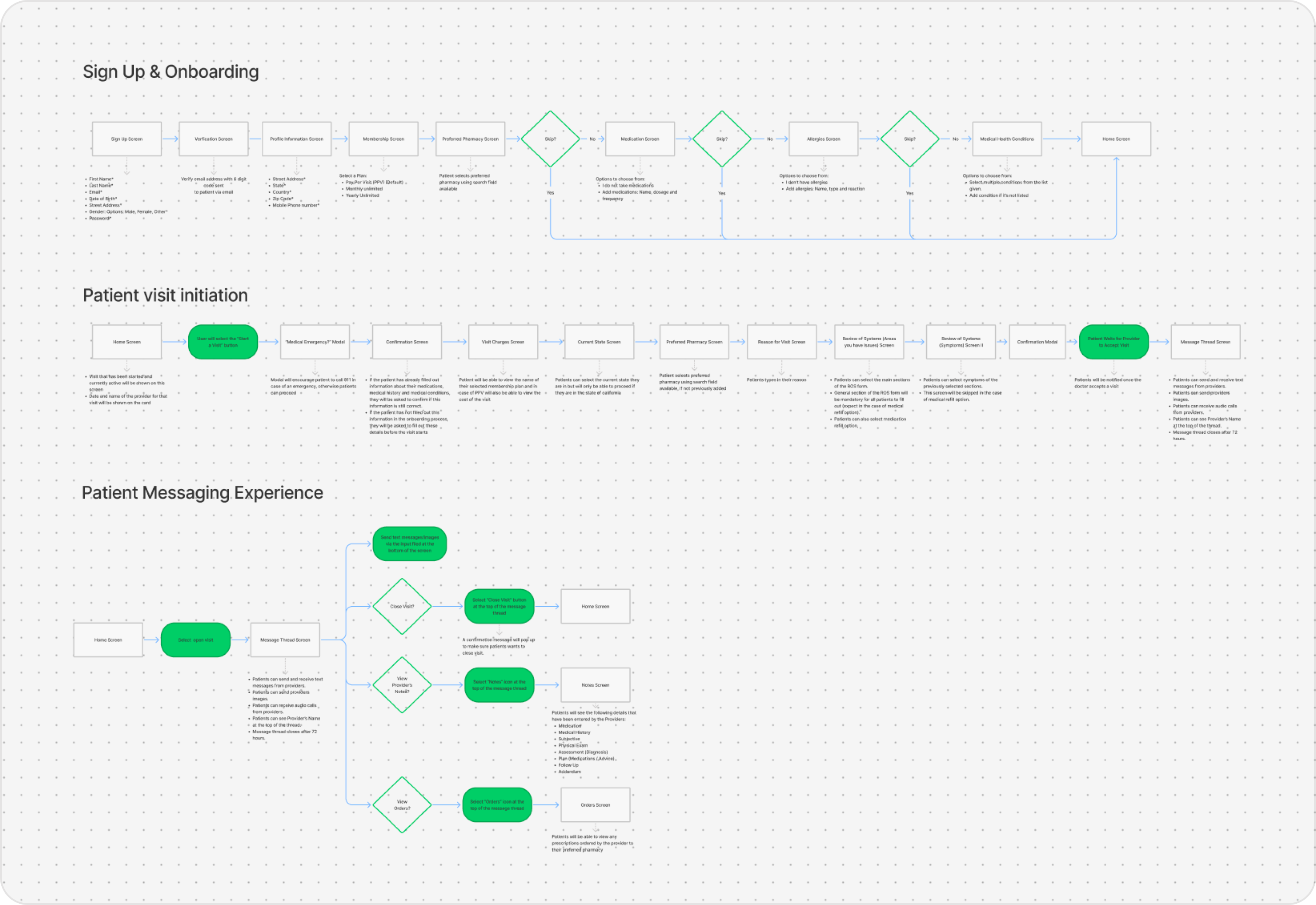
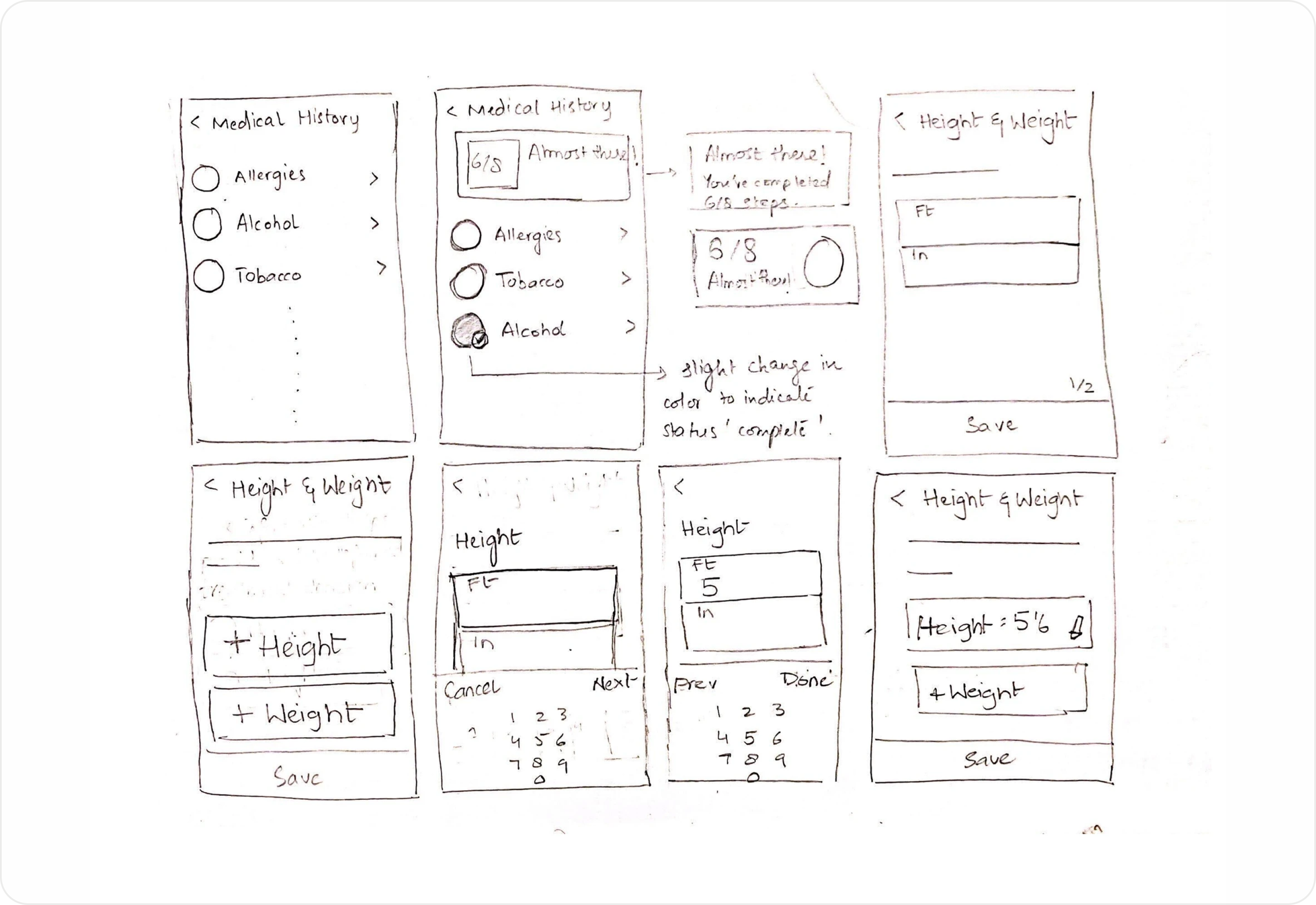
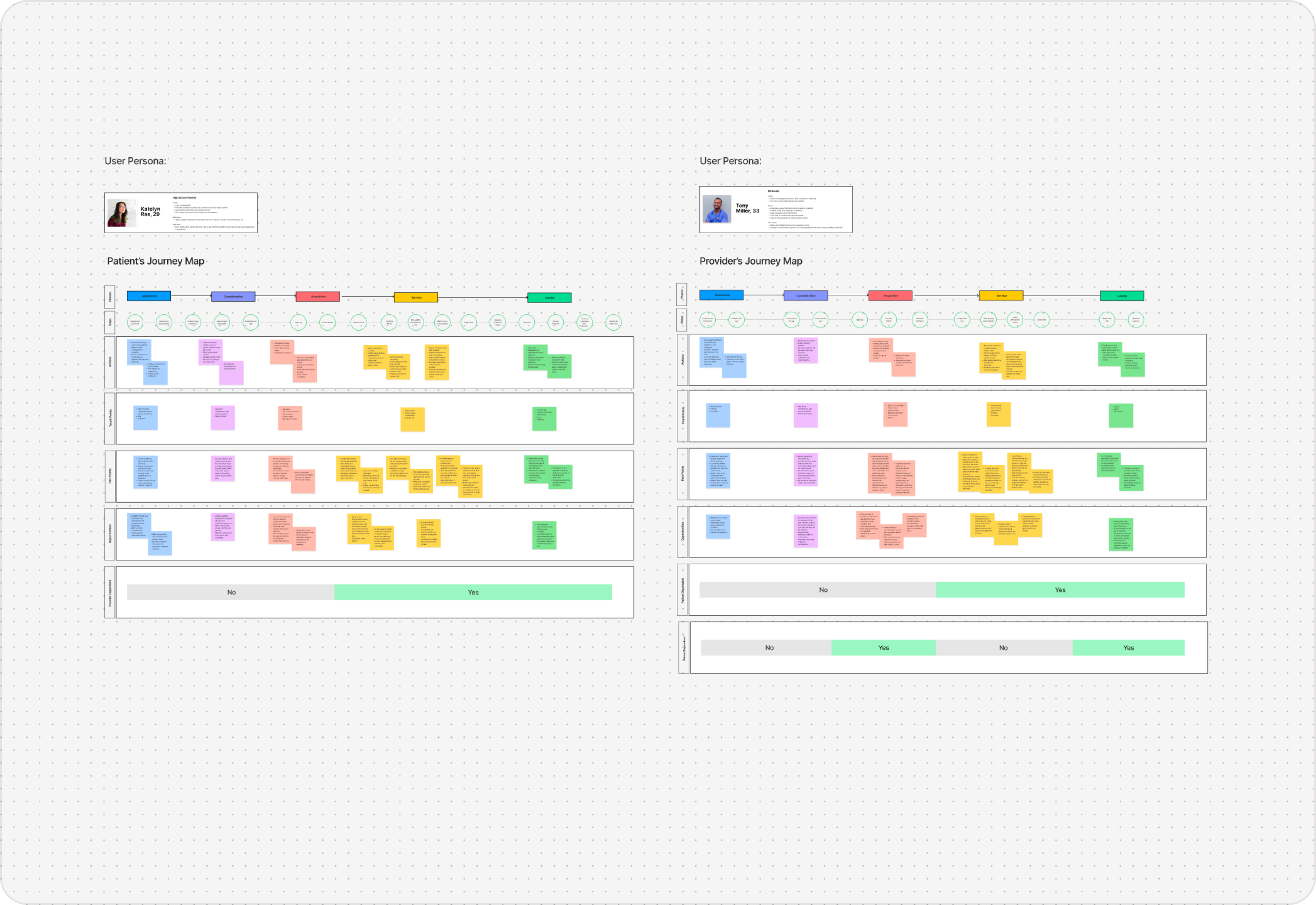
Every consultation begins long before a video call. Every screen started as a sketch. I mapped end-to-end user flows for patients and providers, from symptom entry to prescription, before committing anything to pixels.
Design both sides together
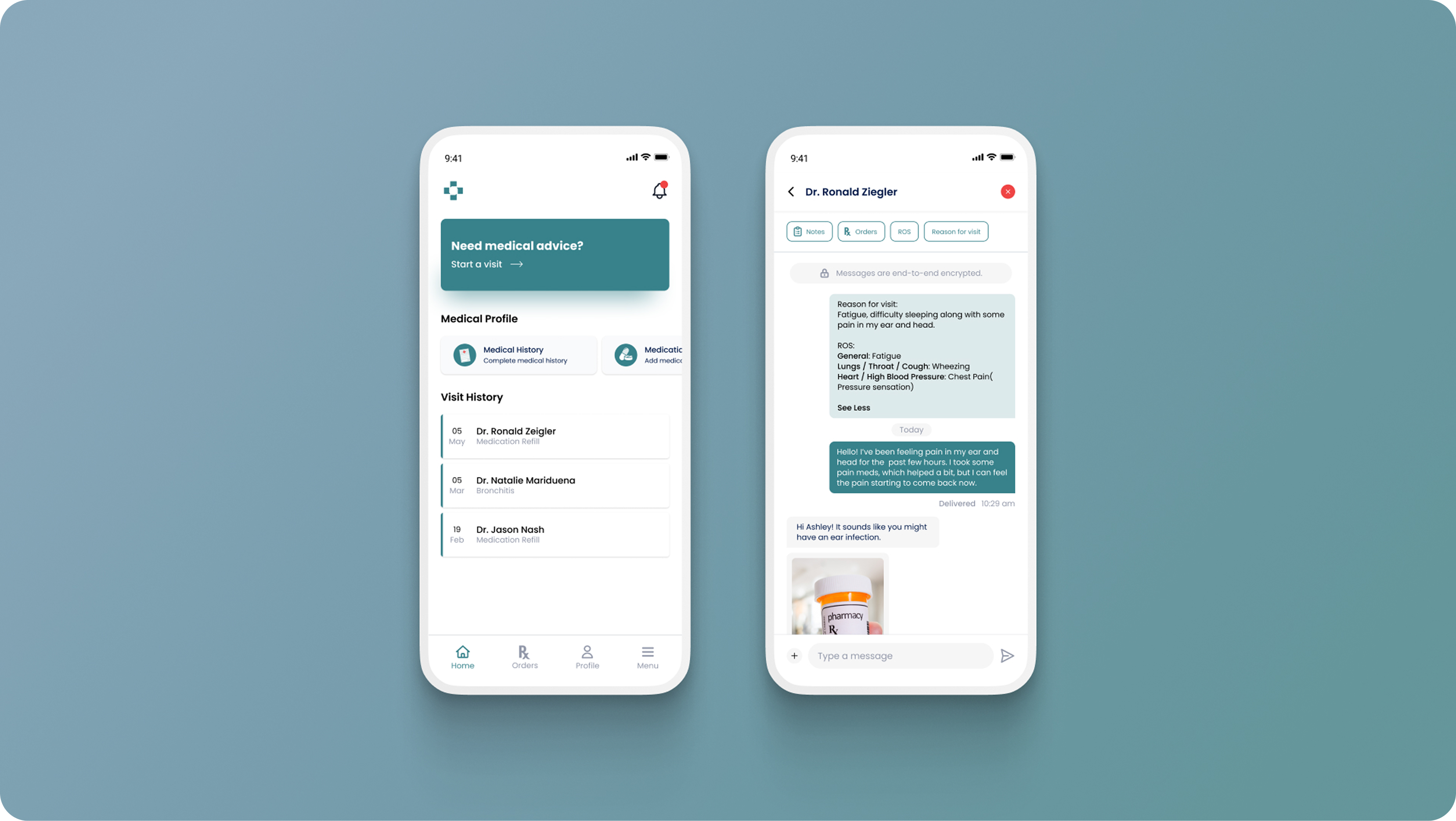
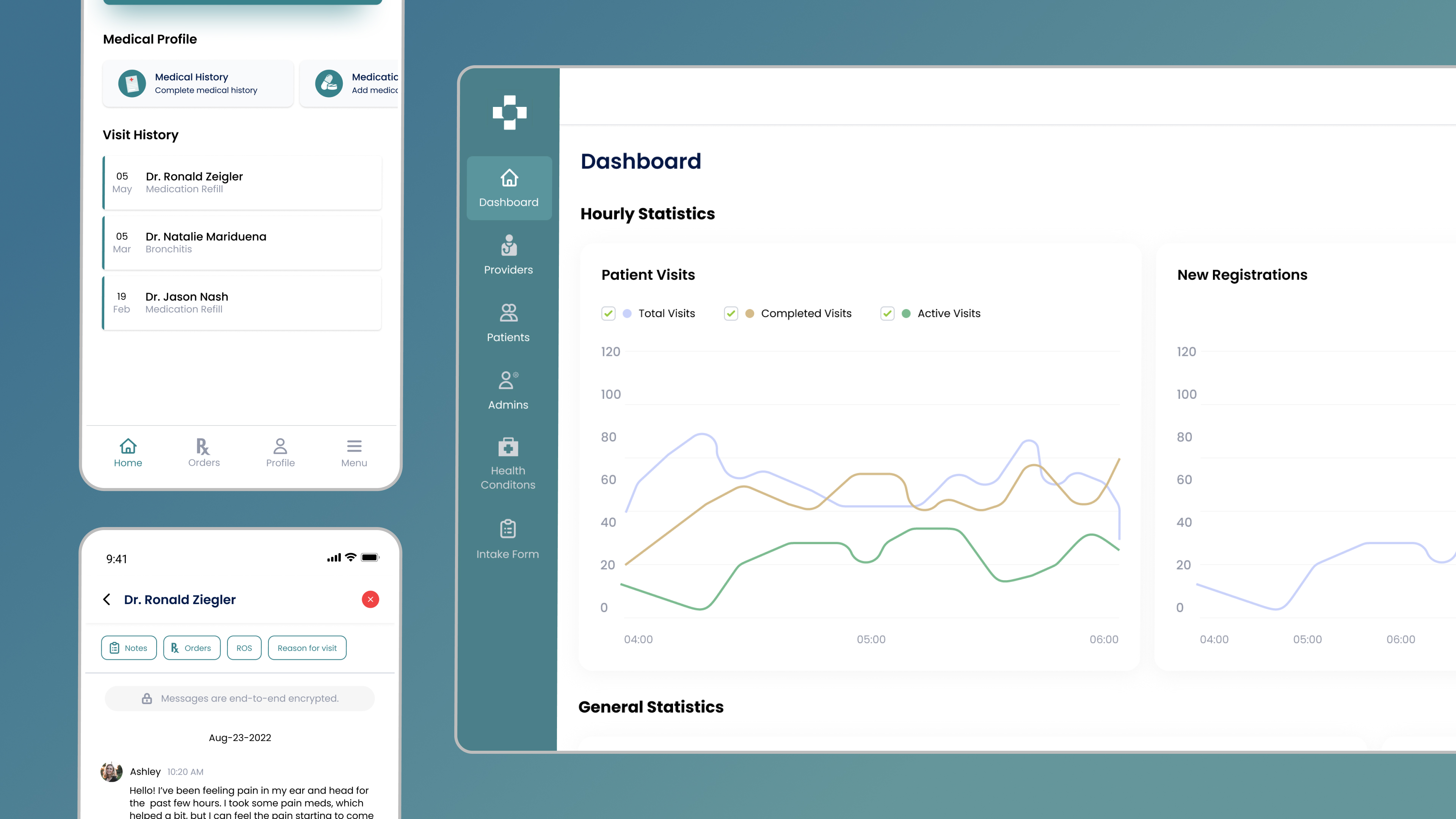
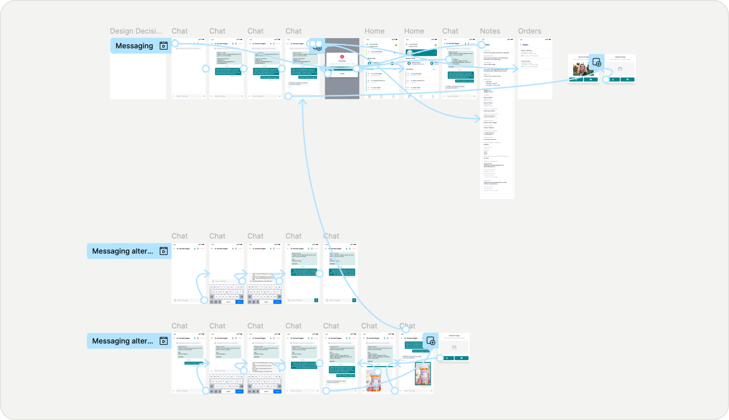
Healthcare products rarely have one user. With flows validated, I designed the paired apps and lightweight EHR in parallel, so every patient action had a mirrored provider counterpart.
Creating a product people could recognise
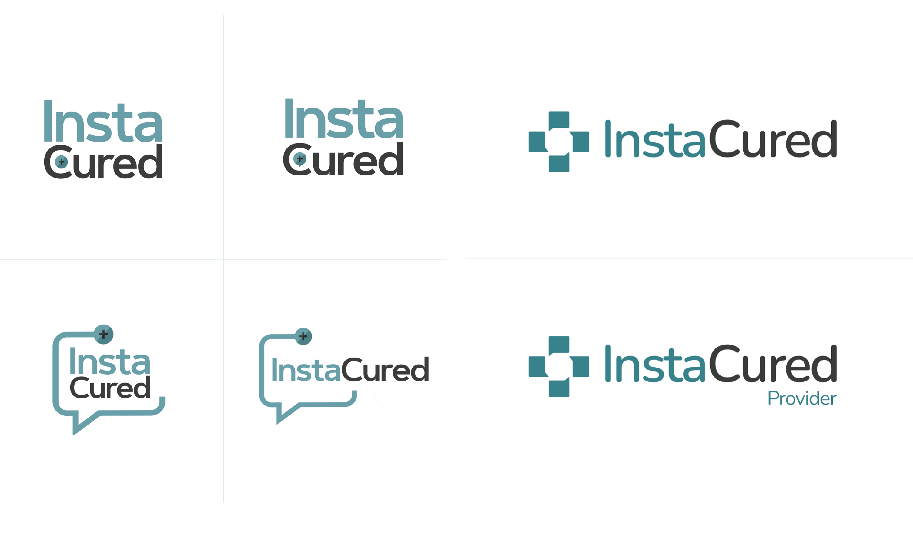
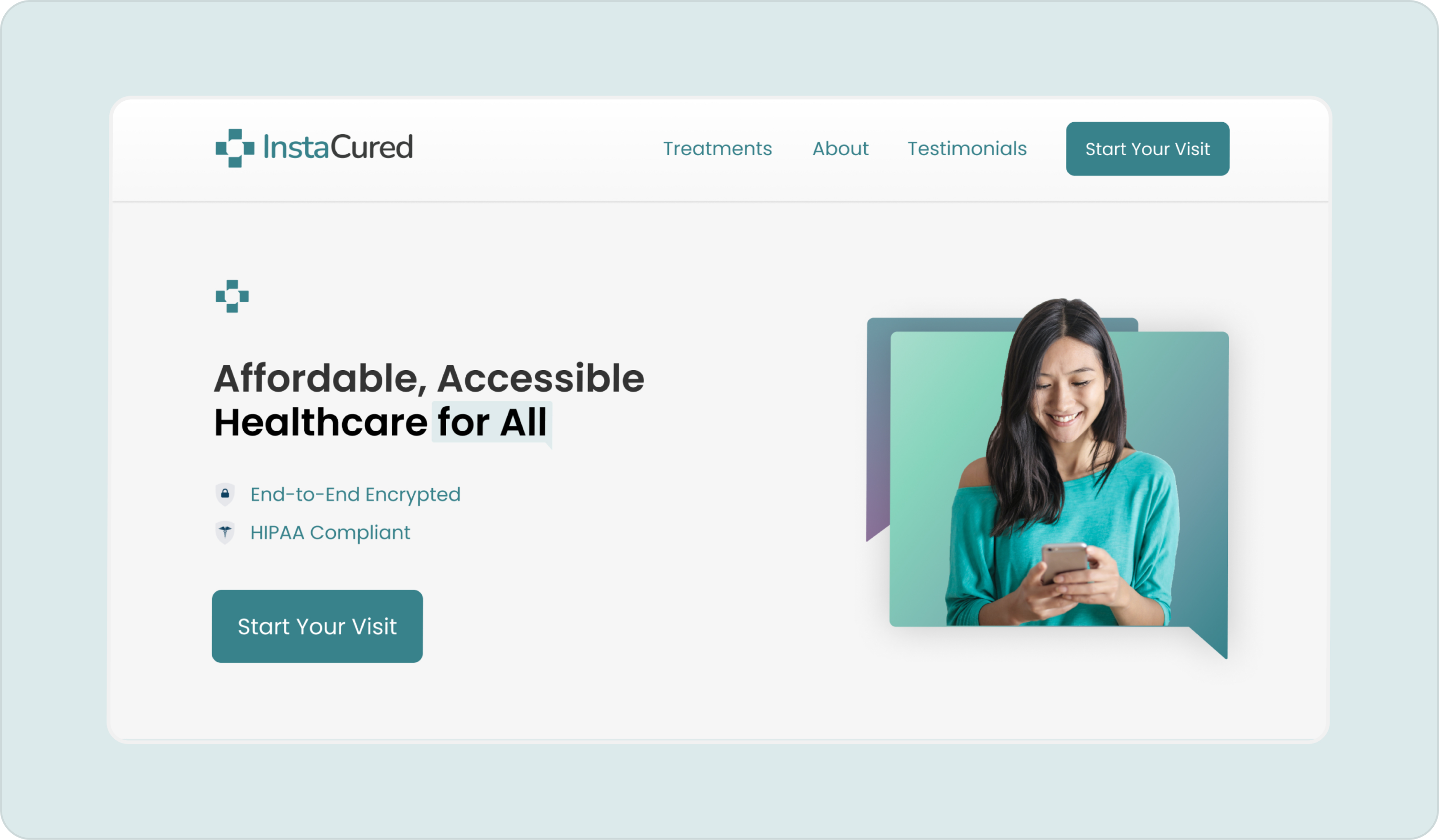
The final layer wasn't decoration, it was trust. Alongside the interfaces, I developed the visual identity, logo, launch assets, and design system that unified every touchpoint, from the App Store listing to the provider dashboard.
Making the most of the team we had
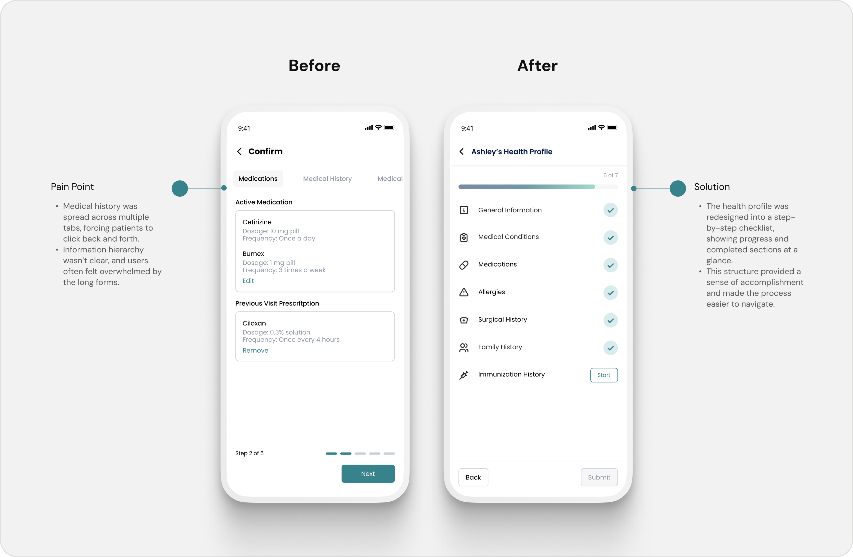
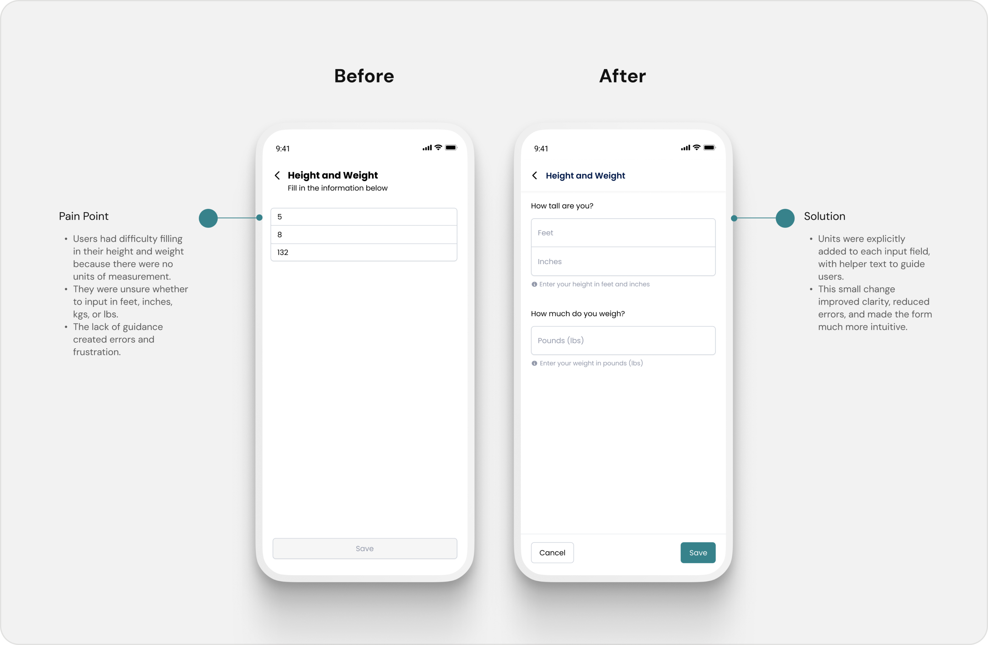
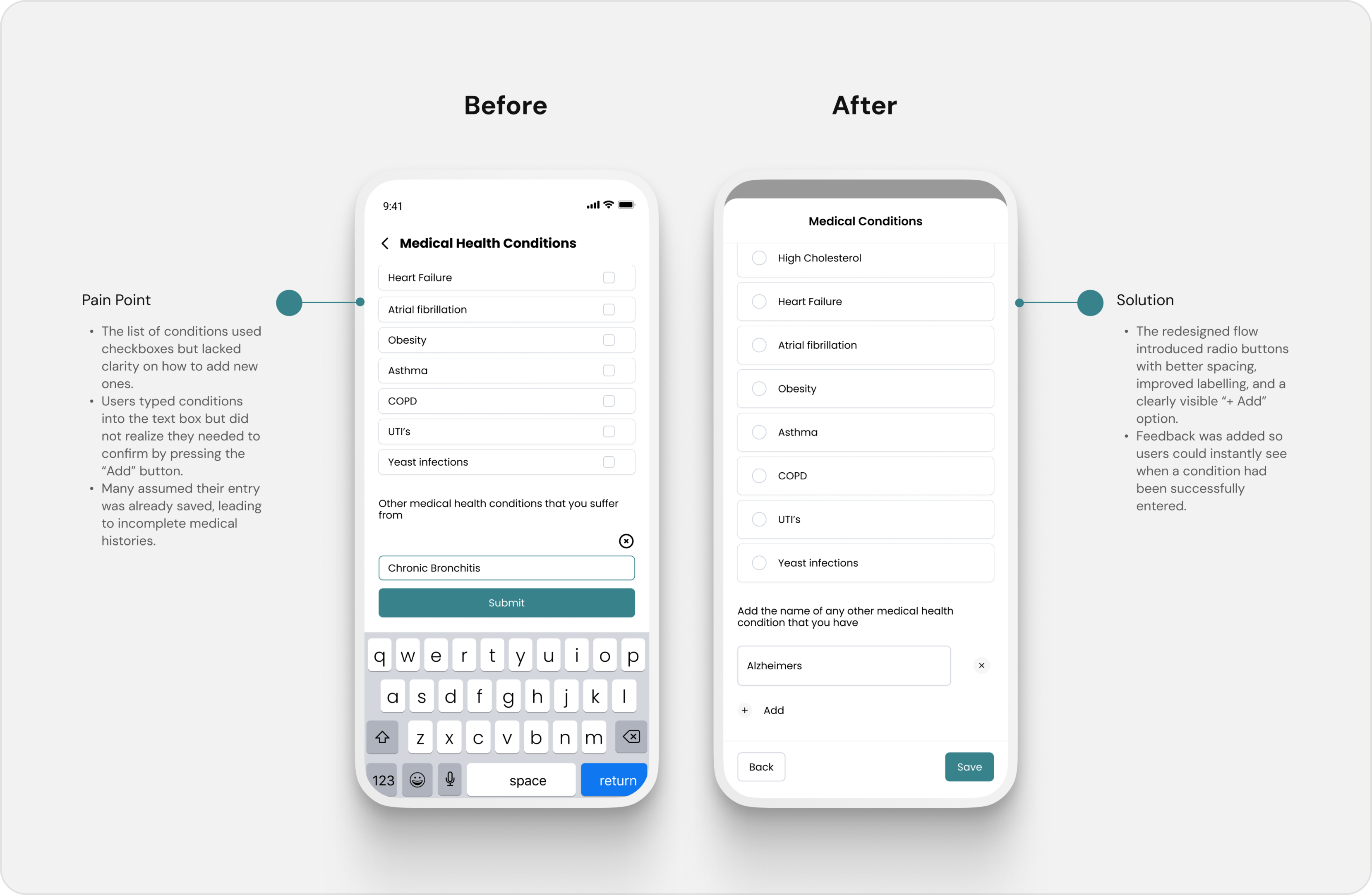
We weren't able to conduct formal usability testing with patients before launch. Instead, we recreated consultations internally. Team members adopted patient and provider personas, completed realistic healthcare scenarios, and documented every point of confusion throughout the experience. Those sessions led directly to three improvements.
Designing the experience
Helping patients reach care faster
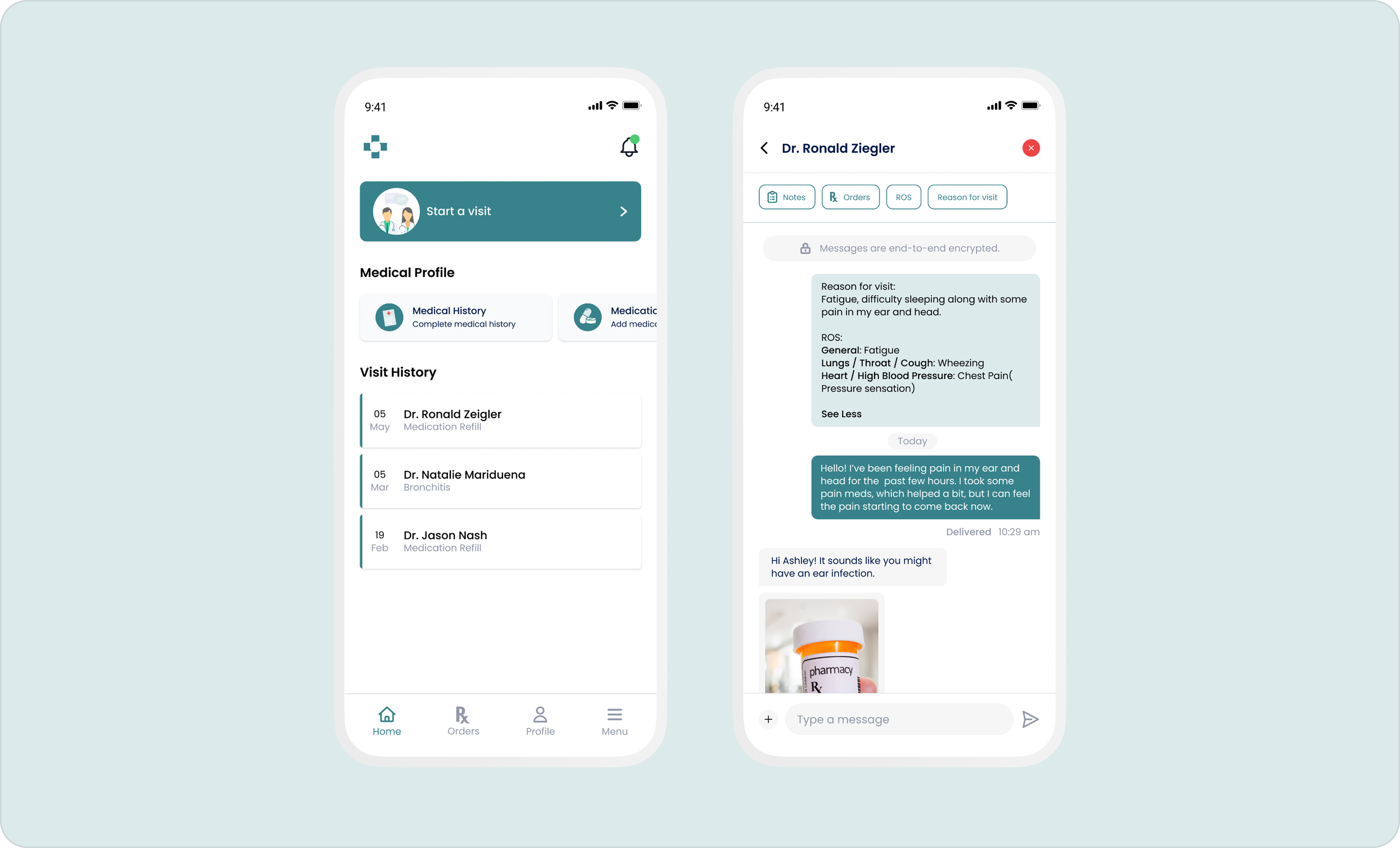
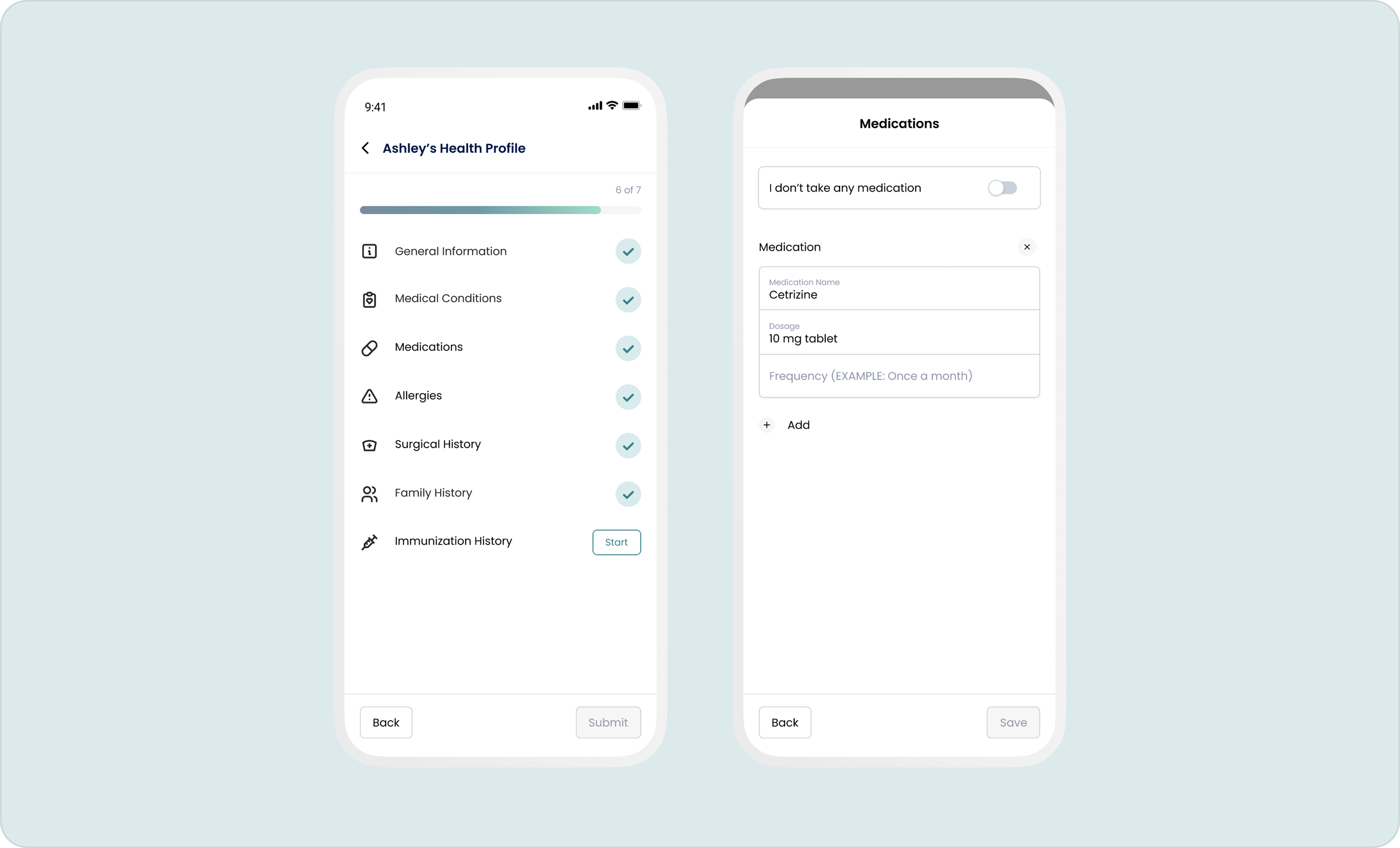
The patient experience was built around reducing hesitation. Medical history was introduced progressively instead of all at once. Pricing became visible before commitment. Booking an appointment felt closer to scheduling a meeting than navigating hospital administration. Every interaction answered one question before introducing the next.
Giving providers everything in one place
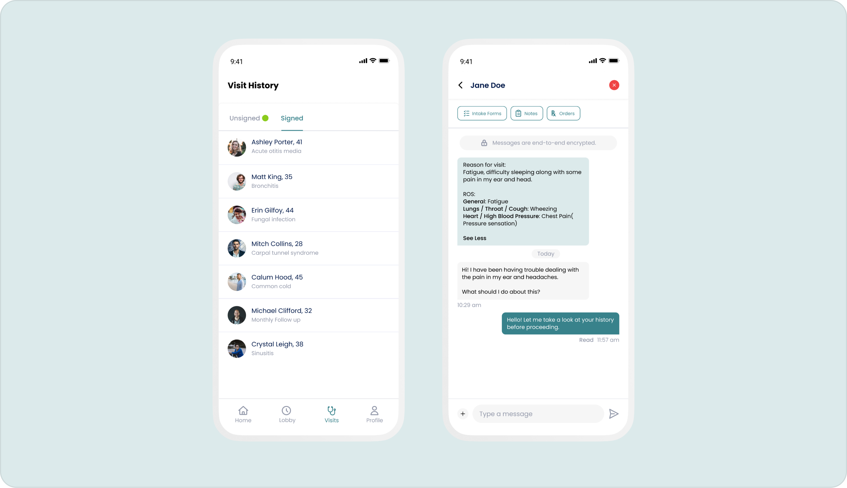
Patients need reassurance. Providers need efficiency. The provider workspace combined appointments, consultations, patient history, prescriptions, and clinical notes into a single interface, reducing context switching during appointments and making documentation feel like part of the consultation instead of work that happened afterwards.
Simplifying things through the admin dashboard
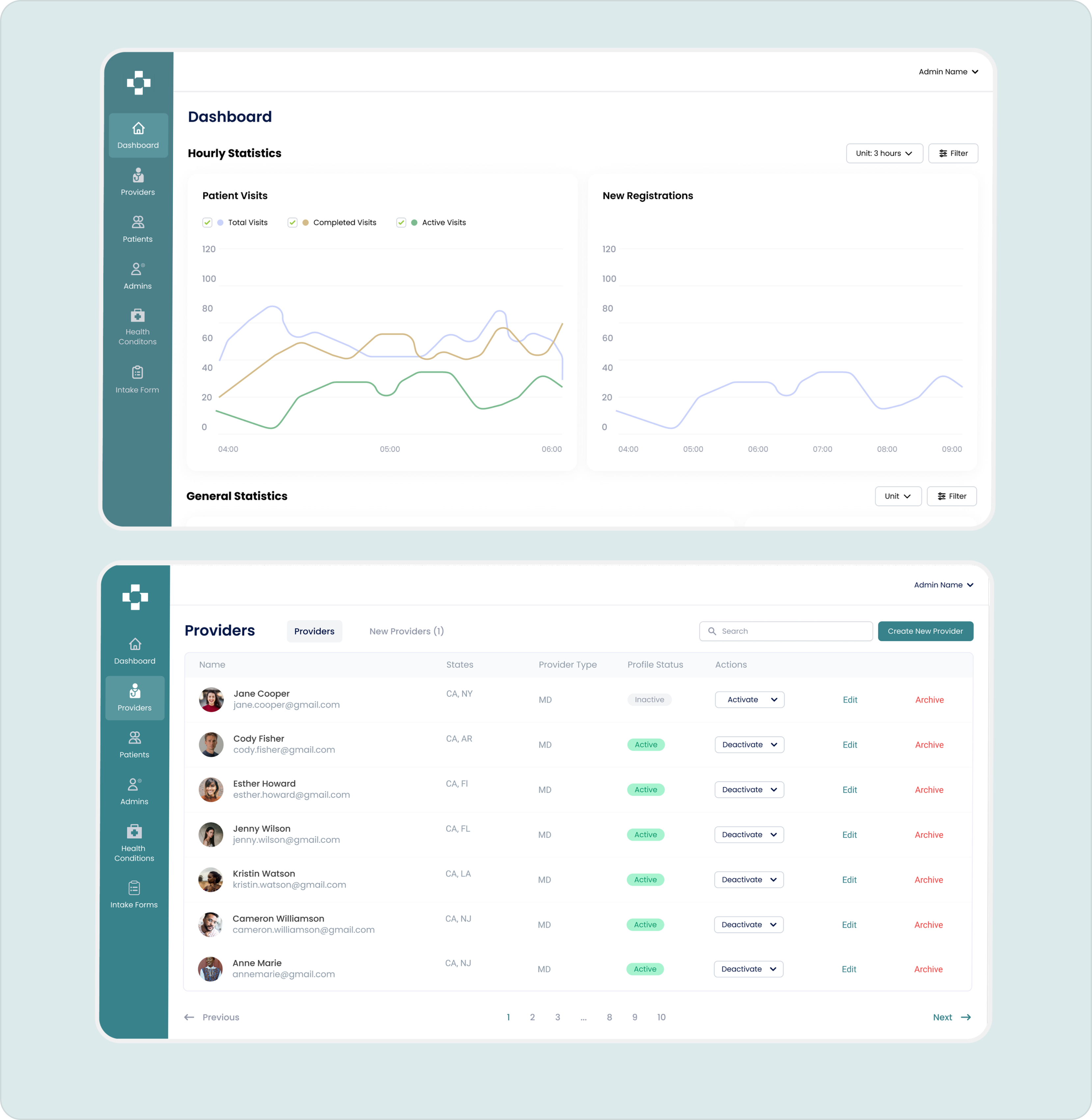
Behind every healthcare platform is an operational team managing the experience. The admin dashboard gave internal teams visibility into users, providers, appointments, and platform activity. It was designed to support everyday operations while maintaining the same visual language and interaction patterns across the product.
Transforming an idea into a product foundation
The final product brought together a patient app, provider workspace, admin dashboard, marketing website, brand identity, and design system into one connected experience.
More than a collection of screens, InstaCured established the foundation for a healthcare platform where every interaction, from booking an appointment to managing a consultation, felt intentional and consistent.